A website is often the first impression people have of a brand, blog, or business. No matter how good your content or products are, poor website design can quickly drive visitors away. In fact, users decide within seconds whether they will stay on a site or leave.
If your website is not getting enough engagement—low time on page, high bounce rate, or few conversions—the problem may not be traffic. It may be design mistakes that are silently hurting user experience.
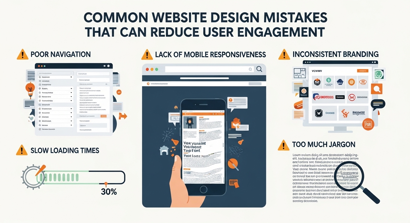
In this article, we’ll explore the most common website design mistakes that reduce user engagement and how you can fix them to improve performance, usability, and conversions.
1. Slow Website Loading Speed
One of the biggest reasons users leave a website is slow loading time. In today’s fast digital world, users expect pages to load in seconds.
Why it matters:
- Users abandon slow websites quickly
- Google ranks fast websites higher
- Poor speed reduces conversions and engagement
Common causes:
- Large uncompressed images
- Heavy scripts and plugins
- Poor hosting
- Unoptimized code
How to fix it:
- Compress images before uploading
- Use caching tools
- Choose a reliable hosting provider
- Minimize unnecessary scripts
A faster website instantly improves user satisfaction.
2. Poor Mobile Responsiveness
More than half of web traffic comes from mobile devices. If your website doesn’t work well on smartphones, you are losing a huge audience.
Signs of a bad mobile design:
- Text is too small
- Buttons are hard to click
- Content is cut off or misaligned
- Pages require horizontal scrolling
Solution:
- Use responsive design frameworks
- Test your site on different screen sizes
- Ensure buttons and menus are mobile-friendly
A mobile-friendly design improves engagement and reduces bounce rate.
3. Cluttered and Confusing Layout
Too much information on a page can overwhelm visitors. A cluttered design makes it hard for users to find what they need.
Problems caused:
- Users feel lost
- Important content gets ignored
- Navigation becomes difficult
How to fix it:
- Use clean and simple layouts
- Add enough white space
- Highlight important sections
- Keep pages organized and structured
A clean design improves readability and user focus.
4. Poor Navigation Structure
If users cannot easily navigate your website, they will leave quickly.
Common navigation mistakes:
- Too many menu items
- Hidden or unclear menus
- Broken links
- No clear homepage structure
Best practices:
- Keep menus simple and organized
- Use clear labels like “Home,” “About,” “Services”
- Add a search bar for large websites
- Ensure all links work properly
Good navigation helps users find what they need in seconds.
5. Weak or Missing Call-to-Action (CTA)
A CTA tells users what to do next—subscribe, buy, read more, or contact.
Mistakes:
- No CTA on pages
- Confusing or unclear buttons
- Weak wording like “Click here”
Better approach:
- Use clear CTAs like “Get Started,” “Download Now,” or “Contact Us”
- Place CTAs in visible areas
- Use contrasting colors for buttons
Strong CTAs guide users and increase engagement.
6. Too Many Pop-ups and Ads
While pop-ups can be useful, overusing them creates a negative experience.
Problems caused:
- Interrupts reading flow
- Annoys users
- Increases bounce rate
Best practice:
- Limit pop-ups to important actions
- Use exit-intent pop-ups only
- Avoid covering main content
Less interruption leads to better user experience.
7. Hard-to-Read Typography
Text readability is often ignored, but it plays a major role in engagement.
Mistakes include:
- Small font size
- Poor color contrast
- Fancy fonts that are hard to read
Fix it by:
- Using clear, simple fonts
- Maintaining good contrast between text and background
- Keeping font size comfortable for reading
Readable content keeps users on your site longer.
8. Lack of Visual Hierarchy
Visual hierarchy helps users understand what is most important on a page.
Without hierarchy:
- Everything looks одинаков
- Users don’t know where to look first
- Important information gets missed
How to improve:
- Use headings and subheadings properly
- Highlight key points with bold text
- Use spacing to separate sections
- Place important content above the fold
A clear structure improves engagement and flow.
9. Not Optimizing for SEO and User Intent
Even a well-designed website will struggle if it doesn’t match user intent.
Common mistakes:
- Irrelevant content
- Missing keywords
- Poor page structure
Solution:
- Write content based on user search intent
- Use proper headings (H1, H2, H3)
- Optimize meta titles and descriptions
- Focus on valuable, helpful content
SEO and design work together to improve engagement.
10. Ignoring User Experience (UX)
User experience is the overall feeling a visitor has while using your website.
Bad UX includes:
- Confusing layouts
- Slow interactions
- Broken elements
- Difficult forms
Improve UX by:
- Keeping design simple
- Testing usability regularly
- Collecting user feedback
- Fixing issues quickly
A smooth experience keeps users coming back.
Final Thoughts
Website design is not just about looks—it is about how users interact with your content. Even small mistakes can significantly reduce engagement, traffic, and conversions.
By avoiding common issues like slow loading speed, poor navigation, cluttered layouts, and weak CTAs, you can create a website that is both attractive and user-friendly.
A well-designed website builds trust, improves retention, and encourages visitors to take action. If you focus on user experience first, engagement will naturally increase over time.